News
NEWS
The Full Story of Remain in, Inc.'s Rebranding
This article is for employees who have recently joined the company or for those who are starting business with Remain in for the first time, to help them gain a deeper understanding of the philosophy that Remain in holds dear.
By candidly revealing the design process, you can understand Remain in's philosophy and culture on a much deeper level.
Hello, I am Hirao, CI Director at ARUTEGA Inc.
I had the privilege of assisting with the formulation of your Corporate Identity (CI/VI/DI).
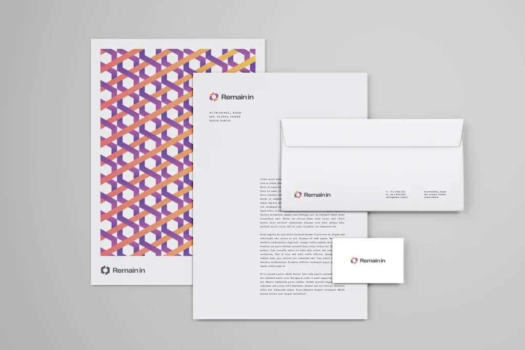
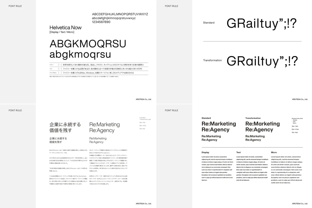
We have produced a full suite of corporate items, including the website you are currently viewing. I will candidly share the values embedded in Remain in's design. We spent a long time on verbalization through repeated dialogues with the founding members.
About Corporate Identity
The relationship between VISION / PURPOSE / STANCE is easier to understand by looking at this:
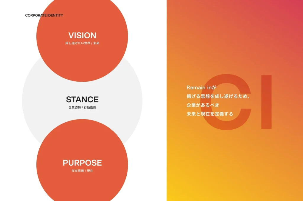
Formulating a CI (Corporate Identity) is not just about enhancing design. It is crucial to build better relationships with society by clarifying and communicating values and culture
About VISION
First, about the VISION at the beginning of the brand guidelines.
VISION states what kind of figure we should aim for in the future.
“CREATE THE EVERLASTING VALUES”
From the beginning, as implied by the company name, the founding members have a strong desire to leave a legacy of value through business across generations. At Remain in, we believe that valuable businesses are those that endure.
About PURPOSE
This corresponds to Remain in's current reason for existence. It indicates our present value.
““Explore business value and create assets.””
To leave assets of knowledge and relationships in our business. Let us create businesses valuable to the world with our collective intelligence. Those achievements will be inherited, and eventually, the assets will become true value.
About STANCE
“Working with integrity”
Each individual is special, overlapping, shining, and resonating. Let's take pride in working with the best partners. We can witness the moment when "good people" leave behind "good things."
Remain in has a culture that encourages and celebrates strong individuality.
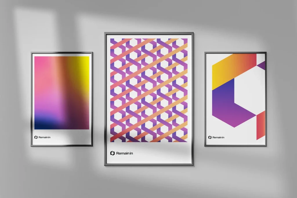
About Logo Design
We went through many iterations of creating and deconstructing the logo.
For that reason, I am confident that it has become an embodiment of the aforementioned VISION / PURPOSE / STANCE.

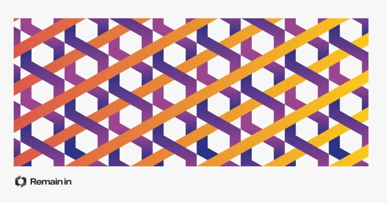
It represents the "everlasting values." While an individual is but one factor, by connecting perpetually, it forms a spiral, expressed as being able to "inherit DNA." Regarding the color scheme: gradation represents growth. Warm colors express decisiveness. Purple hues represent individual charisma, and the landscape style of the logotype signifies classic stability, unaffected by trends.
Finally
Even before we received the request, a vision that was a precursor to the current one already existed, but it was completely renewed with this project.
The brand message we had advocated since then was very strong:
"The proof of our work becomes results and assets, remaining for companies, brands, and individuals." While leveraging this initial impulse, we were able to update it to the current VPS.
In other words, Remain in has a robust vision that is intrinsically linked with its company name. Let all stakeholders unite to create everlasting values.